Wednesday 21 May 2014

Key Words


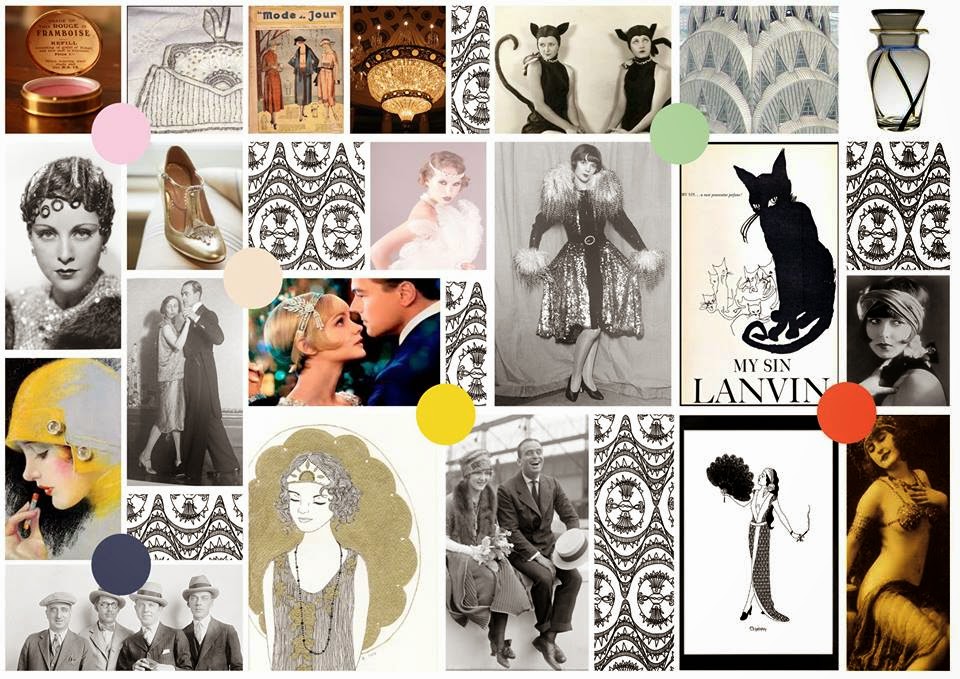
UNDERGROUND - A genre in music and other forms of media intended for an elite audience, that is often characterized by its high levels of originality and experimentation, and does not conform to typical standards, trends, or hypes as set by the popular mainstream media.
• COLLECTABLE - We think collectable is a well suited word for our concept because we would like to have a line that becomes collectable, as we feel our targeted consumer would be the type of individual to have an interest in collectable items as it would become a collection of artistic beauty on their dressing table.
• ENIGMATIC – Enigmatic suits our perfume brand as we like the idea of our perfume not being in your face and not being advertised in a commercial way, as we feel our typical consumer would be more of an explorer.

Insight Vintage clothes have a scent that’s distinctive, however not in a nice way, it’s a usual musty smell that everyone wants to get rid of. At the moment on the market there is no perfume targeted for a purely vintage consumer.
Aim
Our aim is to create a perfume that is the real definition of vintage, not the usual stereotypes that people have with vintage today, and a perfume that eliminates the vintage mouth ball smell.
Big idea
• Create a fragrance that appeals to people who don’t wear commercial fragrance as it does not fit with their lifestyle, so targeting the individual’s who want a perfume that truly reflects vintage Big idea
• Create a fragrance that appeals to people who don’t wear commercial fragrance as it does not fit with their lifestyle, so targeting the individual’s who want a perfume that truly reflects vintage We are going to use social situations that people who support the vintage lifestyle would encounter, such as gigs, art exhibitions to advertise, use social media such as twitter, Facebook, instagram etc.
• Big idea
• Create a fragrance that appeals to people who don’t wear commercial fragrance as it does not fit with their lifestyle, so targeting the individual’s who want a perfume that truly reflects vintage.
• We are going to use social situations that people who support the vintage lifestyle would encounter, such as gigs, art exhibitions to advertise, use social media such as twitter, Facebook, instagram etc.
• Big idea
• Create a fragrance that appeals to people who don’t wear commercial fragrance as it does not fit with their lifestyle, so targeting the individual’s who want a perfume that truly reflects vintage.

Creating Our Juice


Karen Gilbert held a work shop with our group where we were able to learn how to create a scent. We decided to incorporate Wood, Tobacco, Musk, PE.a, Iris and Jasmine. This made a really nice natural scent that isn't too feminine or light.
Right from the beginning of the project I was really excited for this workshop and it turned out to be really interesting. I think we were able to achieve close enough to the scent we were aiming for to be happy with it.


Front Cover


We recently had a guest lecturer in to speak about her product which her and her partner created. Michelle and Liz are the creative directors of Front cover, a ready to wear make up collection all in one box where you can create all different looks that have been seen on the catwalk.
 
They had previously worked with brands such as Ruby & Millie, St. Tropez, James Brown and Naked Body care.


They realised there was a gap in the market. If you wanted to create a certain look you would have to spend a fortune on different separate items, where as Front cover give you everything you need in one box with detailed instructions from make up artists. They also insisted that the photography on the front of the product are all looks that you can achieve with the products in the box.  

 
They built the brand upon the basis that once the season has gone you can't purchase that seasons looks anymore, much like clothing items in shops. This creates a need to buy the product through the fear and knowledge that it won't always be available.

 
Affordability was key in their creation of the product as they wanted it to be accessible to everyone. Michelle explained that the product quality and innovation are at the heart of their brand. She explained that they have many returning customers and fans due to the product being a high quality product which works.
 
 
" Always keep in mind your customer and you can't go wrong "


Moodboards

 
This Moodboard we created to show what we are trying to stay away from in our design element. We feel like the word vintage is over used and we need to steer clear of floral's and pastel colours if we don't want to make the same mistake.

 
We wanted to explore different Eras as well as we feel that there are many aspects of vintage fashion based on different eras. This Moodboard in particular is focusing on 80s vintage fashion.

 
We have also used a Moodboard to create a visual customer profile so it is easier to portray to the group and our product designer the type of person we will be marketing to.


Thursday 8 May 2014

Karen Gilbert

Karen Gilbert is another guest lecturer we have had recently. She has worked in international Flavours and Fragrances.

" Fragrance is a way of communicating without words, fragrance can make us think, feel or react without ever knowing why " - I understood what this meant as only last week I bought a new lip balm and the smell just brought me back to when I was about 6 years old and I got a Barbie lip gloss set which had the identical smell this this lip balm, it was really strange how I straight away remembered and associated these scents.

" Fragrance is a major factor is the development of a new product or even an environment " - It triggers memories, creates emotions, and emotions cause reactions. Hopefully then for the brand this creates an emotional attachment between the consumer and the product.

Karen gave a brief time line of the fragrance market from the 1920s which I thought was quite helpful towards our particular project as our group are concentrating on creating a vintage style perfume.

1920s- Emancipation, Coco Chanel, the First fragrance to be launched by a clothing designer.

1930s - 1940s - Hollywood Glamour

1950s - 1970s - Establishing Mass Market, Este Lauder created 'Youth Dew' a bath oil
                         which was seen as less wasteful as a bottle of perfume so women             could purchase the product without guilt.
Revlon was responsible for creating the Mass Market, which Charlie contributed to with cheap perfume which made it affordable for everyone.

1980s - Money and Power, Poison Dior released

1990s - Zen and Spirituality, new era for fashion and fragrance

2000s - Cult and Celebrity, Niche and High end Luxe.


One thing Karen said in the Lecture was that if our brand was a flavour of ice cream would it be Vanilla or Pistachio?

Vanilla is excepted and loved by many as it isn't too offensive or out there

Pistachio is more niche, those who love it really love it and would stay loyal but many will not fancy it at all.


As our brand is targeted at a certain type of consumer - those who buy into the vintage life style I strongly feel that our brand is Pistachio. I'm aware that when we give our presentation there will be many who will not like our brand, or maybe not relate to our ideas however there will be some people who like it (she says hopefully) . 

Niche brands have more focus on ingredients rather than fancy packaging as the brand will have a smaller reach, more of a cult following as it is more creative than versatile.

Jonathan Armstrong

We had a very inspiring guest lecturer recently. Jonathan Armstrong is a Creative Director who has worked with many big brands over the years. The brand that he mainly focused on was an Italian sport brand - Ellesse. He gave us a run through of the background and history of he brand which I found really interesting. The brand was started up by Leonardo Servadio, an Italian Playboy with a passion for skiing. The brand started as colourful and stylish ski wear later evolving into tennis wear as well.

The brand seems fun and fashionable, it is associated with the 'Elite people' as it is a glamorous sports brand over a serious athletic sports brand. This brand essence is evident in their advertisements as well as the garments themselves.


Jonathan explained that the logo is based of the shape of half a tennis ball and the shape of two ski tips, the two sports that the brand is mainly associated with. The brands focus points are attention to detail, modern thinking, sports inspired fashionable colourful pieces.

Jonathan ran through the process of creating an advertisement from being given a brief, brainstorming, finalising ideas, modifying ideas, working within a budget, overcoming problems and producing a final outcome. Of course this whole process would take months but I found it very appealing. I like to plan to things, I like the idea of working in a team and bouncing of each other (as long as everyone is committed). He seemed very enthusiastic yet down to earth about his job which seems to suit him perfectly. He spoke about flying over to Italy for photo shoots and visiting ski
resorts for the winter advertisement.

It was also pointed out that even if you have an idea that you love, you cant always go with it as it is up to the brand giving the brief, however he did seem proud of what was produced, which I would be too, as it was a huge success and from what I could gather suited the brand perfectly.

He spoke about the different type of briefs, this one is particular was to increase brand awareness, not to be product focused but to be simple, stylish, colourful and to focus on the brand truths of - looking good, getting involved and  not necessarily winning but looking good taking part.

They decided to run with the concept of - Italians do it better, through poster art, simply beautiful people in luxury playgrounds. They chose the artist Robert McGinnis, the artist for the Stella Artois and James Bond posters which fits in with their concept perfectly.

Here are some of the final advertisements.


Wednesday 30 April 2014

Guest Lecturer - Adam Brandon

We have had a fair few Guest Lecturers in this part of the course which I have found really useful for our project, One recently being Adam Brandon, a young graphic designer, art director, motion designer, typographer, digital film maker, animator, 3d artist or 'Creative'.

He gave us a run through of some of the projects he's worked on since leaving University which I must say was quite outstanding. I'm not sure if its the norm, but it sounded like he's done really well for himself.

Some of the projects included working on The Oscars, with BT, PlayStation, Samsung, Footlocker and many more. I could tell that this type of job required long hours in front of a computer, a route I cant say I'm overly fussed about going down, however you could really see his passion.

Most of these projects came from working for a company called The Mill. This stood out to me as a really great way to start a career as they gave him so many opportunities to work with big name brands and companies.

He also pointed out that even if you have a great idea that you want to run with that someone's you have to do things you don't want to do or work within a brief and sometimes even create things that you hate that the client will love. It was nice have a lecture from someone younger that has done well for themselves who wasn't patronising or arrogant about their career.

Monday 21 April 2014

Perfumeries

As well as walking around Brick Lane and the east end, we also visited a few perfumeries in Mayfair and around oxford circus, however we found that they were not as forthcoming with the information we needed. We also found that there was less to take inspiration from, however what we did find useful was the ingredients of these niche perfumes as they are more natural that the commercial perfumes. We thought that this would be something that our consumer would be interested in.


Perfume Project

We are quite far along now in a project to develop a fragrance for a brand they we in groups of four have created. So far I have enjoyed the project as I feel that now that as a group we are a team compared to before where it was a bit hit and miss.

We've entertained many ideas along the way but we all decided that we felt that there was a gap in the market for a vintage style perfume which would tap into the true meaning of vintage instead of the over used bhs or marks and spencer's version of vintage style.

Two out of four group members went to brick lane and it was a really useful day in terms of research as we were able to go into loads of vintage clothing stores and speak to the people working there as well as the customers as they are our target consumer. We also went for an amazing curry for lunch ;)

One main factor that was commented on is the smell of vintage clothes being so strong due to dust and moth balls, so most said that they would appreciate a stronger scent.
We as a group felt that there was a gap in the market for a more underground vintage style perfume. We managed to get some useful pictures that we can use in our mood boards when briefing the product designers.


Monday 10 February 2014

Nottingham


We have been asked as part of our course to explore a city of our choice and document how products are launched, shop layouts, promotions and anything we find interesting.

The majority of the group visited New York as a trip however as I had just been to New York earlier in the year I thought I'd save the pennies and sit that one out. Unfortunately this means that I have had my new home town of Nottingham as my city of my 'choice'.

I realised pretty quickly that there were no new product launches taking place in the range of shops that I looked around. I think this is because for new products the launches for England with a brand would be in London.

However I did document a range of shops promotions as most had sales on between the lower end high street shops right up to the higher end and designer.
I also took note of anything interesting I found with window displays and visual merchandising and how this related to and suited the city of Nottingham.  


The majority of the designer and high end high street brand stores are in The Exchange, a small centre for these shops located in the heart of Nottingham city centre. This partitions off the more luxury brands from the low end high street shops.  


As you can see the collection of brands within The Exchange tend to promote their sales in a more minimal and understated way to in keep with the brands prestige and high quality.


There are however some exceptions which mirror the promotional style of high street shops such as USC, Debenhams and JD sports, all of which contain designer brands but who all promote their sales in a very bold and eye catching way. I believe the reason for this style of promotion in these particular shops in Nottingham is due to their location. As these shops are located along a high street in Nottingham the idea is to catch the passing consumer's eye. This is not necessary with in The Exchange so the shops that have promoted for example with balloons etc have done so out of style choice which may suit their brands style.


Even along the high streets in Nottingham the more up market shops such as Jack Wills advertise their sales but not in a bold manner like many other shops. I think this is to in keep once again with their brand image. Some of these shops for example coast have their sale signs in colours such as dark pink or other shops use window vinyl's to advertise their sales.


Surprisingly Debenhams advertise their sales in a lower end brand style with huge yellow bold sale signs with bold fonts and capital letters.


On the other side of the city there are multiple vintage shops. One of my favourites is Back Lash, a small vintage clothing shop with worn and unworn vintage clothing accessories and shoes. The way that Backlash advertise offers is much more refined compared to chain stores which stays true to being a vintage store. The offers are hand written in black pen and placed in the wonderful window display that entails an old scooter, vintage dolls and vinyl sleeves. This in keeps with the shops image and style and looks interesting and appealing to the passing trade who are interested in a more quirky shop with individual pieces.


This quirky style is also used  in the beautiful shop in central Nottingham called White Stuff.


As you can see the interior of the shop itself is really different. I personally love the individually tiled stair case, I think it adds to the shops quirky image. The promotions for the shop sale is also fairly understated and unusual for example the mannequin wearing a t-shirt and a notice stand outside the shop.


The fitting rooms are the best part of the shop as they are individually decorated to look like different hallways each decorated with different items. This reminded me of the style adopted in the vintage store Backlash as retro collectables are dotted around the shop to achieve a retro look.


The window displays are humorous and different. This particular display has pieces of bark, potato bags, spades and window vinyl's with 'sow happy' this word play is used in true White Stuff style to promote their relaxed outdoors range. This natural and outdoors theme is consistent throughout the shop. The shoes are displayed on fake grass.


Shops like Ted Baker use multiple communication pathways such as Facebook groups, twitter pages and blogs. Their website is displayed on the front windows of the store along with signs to alert customers about a free Wi-Fi cloud available in the store. This is an approach taken on by many brands now as a way to create an alternative way for the consumer to view the brands collections and to purchase from the brand.